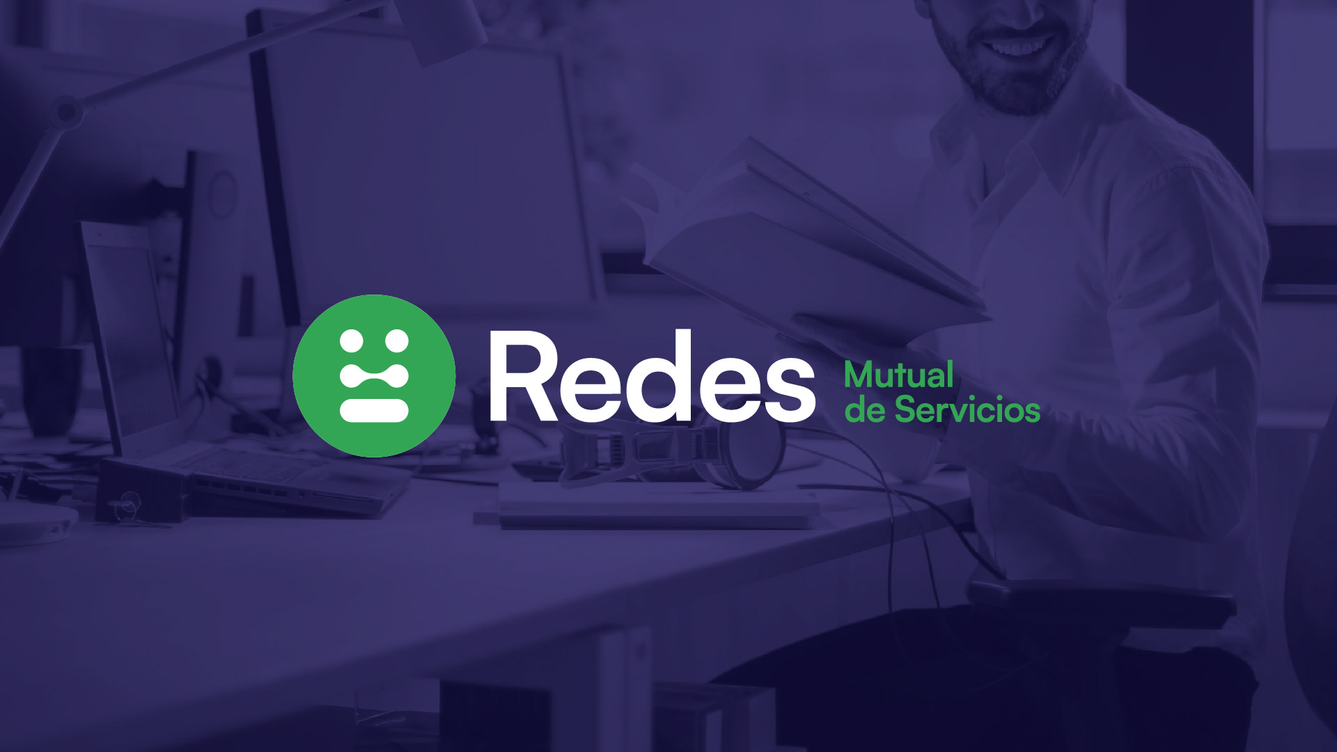
Redes Mutual de Servicios / Scope: Logo & Visual Identity
Redes Mutual de Servicios es una entidad ubicada en Oberá, Misiones, dedicada a ofrecer beneficios económicos y sociales a sus afiliados. Estos beneficios incluyen convenios con establecimientos gastronómicos y hoteleros, servicios de salud, turismo, farmacia, recreación, y más. La mutual también gestiona préstamos y subsidios, apoyando a sus miembros en diversas etapas de la vida.
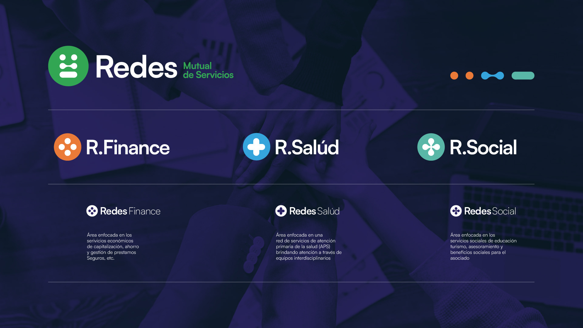
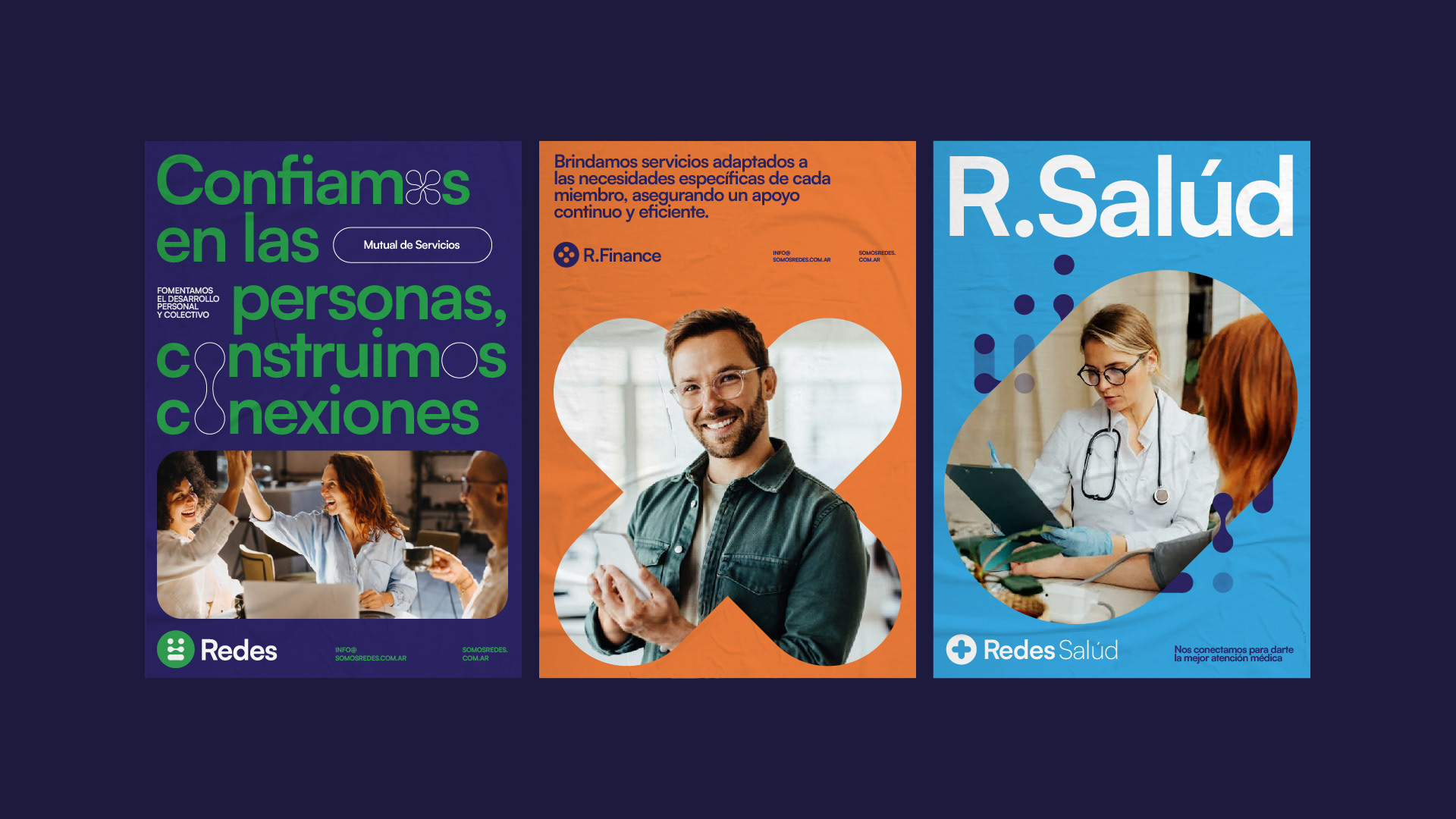
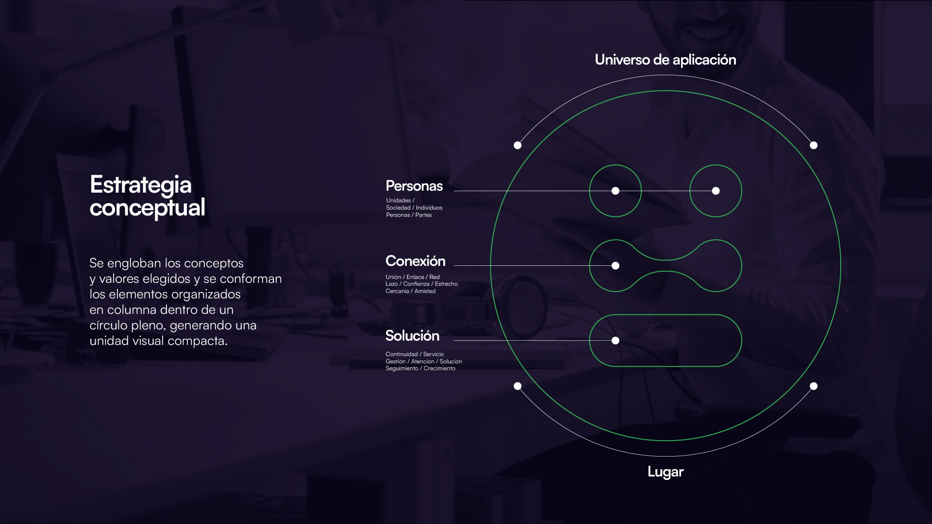
Nos enfocamos en la Estrategia Conceptual para definir su Estrategia Estilística y proyectar su posicionamiento y propuesta de valor. La marca necesitaba una estructura clara para comunicar sus diversos servicios, por lo que creamos una arquitectura monolítica que permitió organizar su comunicación: Redes Finance, enfocada en servicios económicos y gestión de préstamos; Redes Salud, dedicada a la atención primaria de la salud; y Redes Social, centrada en servicios sociales, educación y turismo. Esta segmentación facilitó la identificación y comunicación de cada área de servicio, destacando su compromiso con el bienestar integral de sus afiliados.
[EN]
Redes Mutual de Servicios is an entity located in Oberá, Misiones, dedicated to offering economic and social benefits to its members. These benefits include agreements with gastronomic and hotel establishments, health services, tourism, pharmacy, recreation, and more. The mutual also manages loans and subsidies, supporting its members at various stages of life. We focused on their Conceptual Strategy to define their Stylistic Strategy and project their positioning and value proposition. The brand needed a clear structure to communicate its diverse services, so we created a monolithic brand architecture that organized their communication: Redes Finance, focused on economic services and loan management; Redes Salud, dedicated to primary healthcare services; and Redes Social, centered on social services, education, and tourism. This segmentation facilitated the identification and communication of each service area, highlighting their commitment to the comprehensive well-being of their members.
© Febrero 2022 | Logo & Visual Identity | INGENIO DS Branding
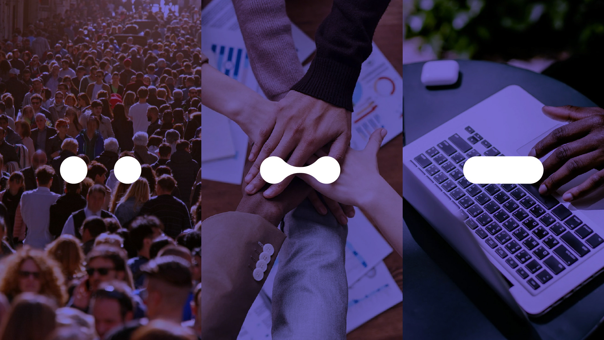
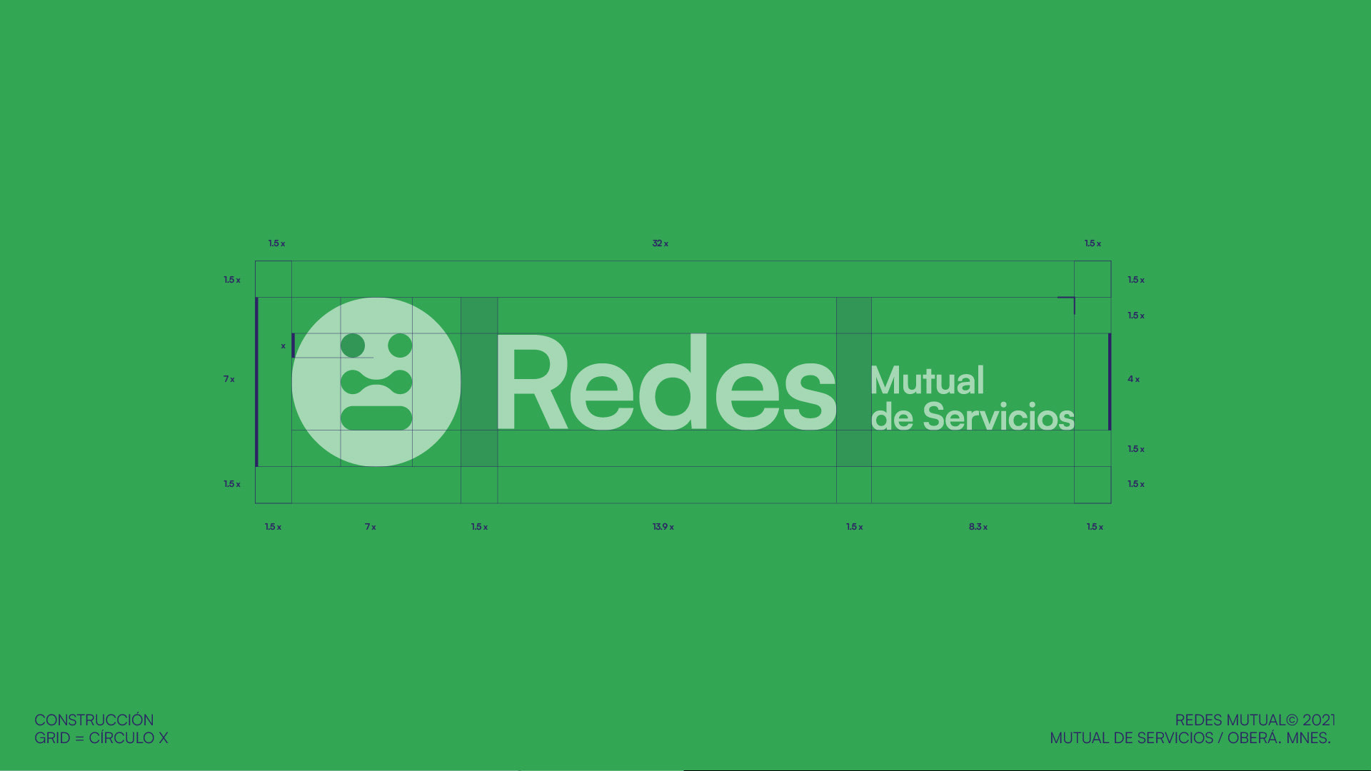
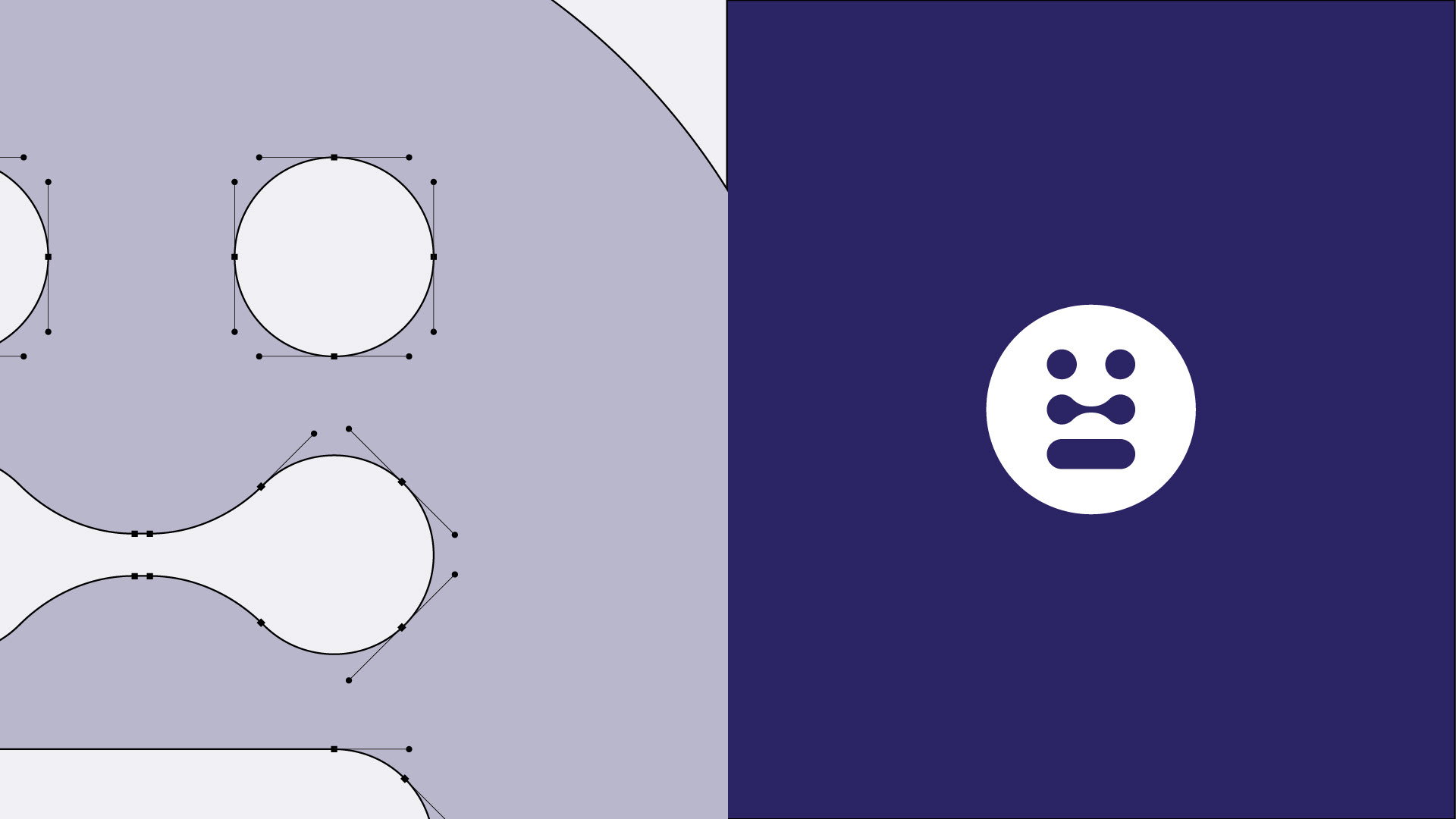
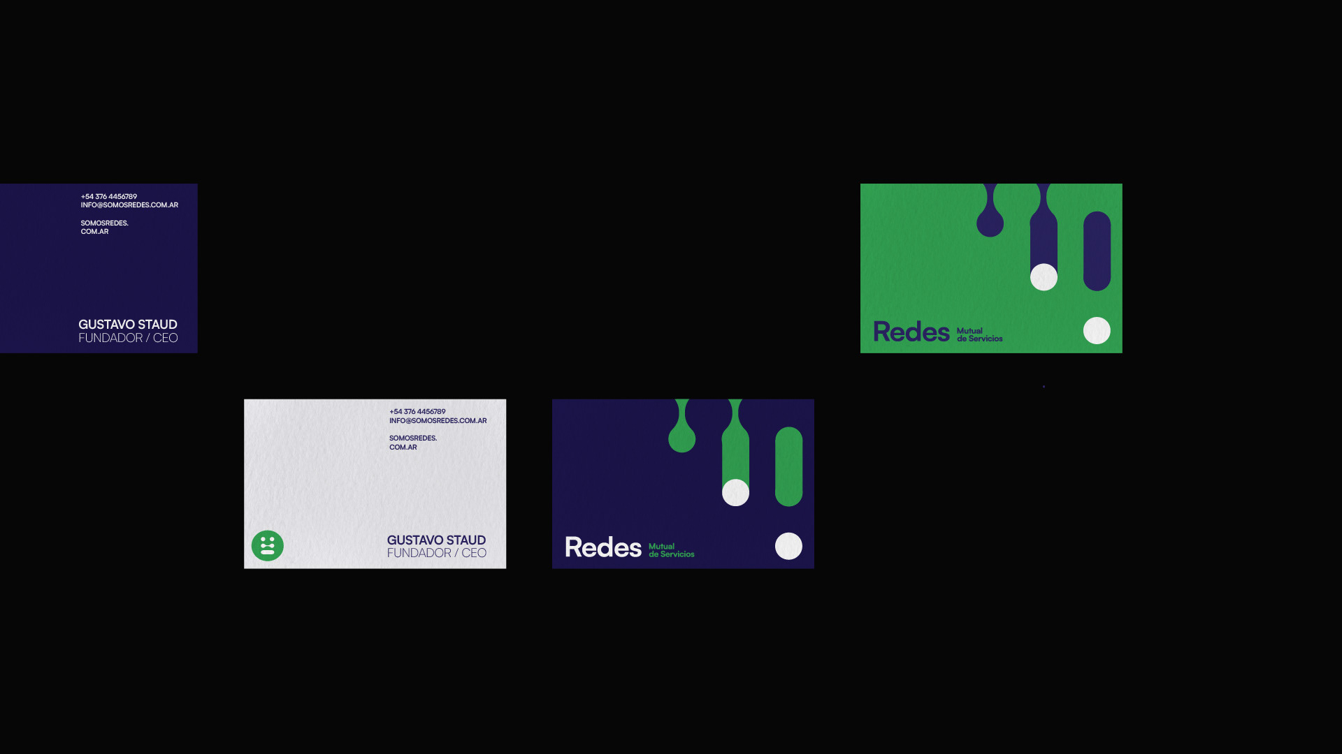
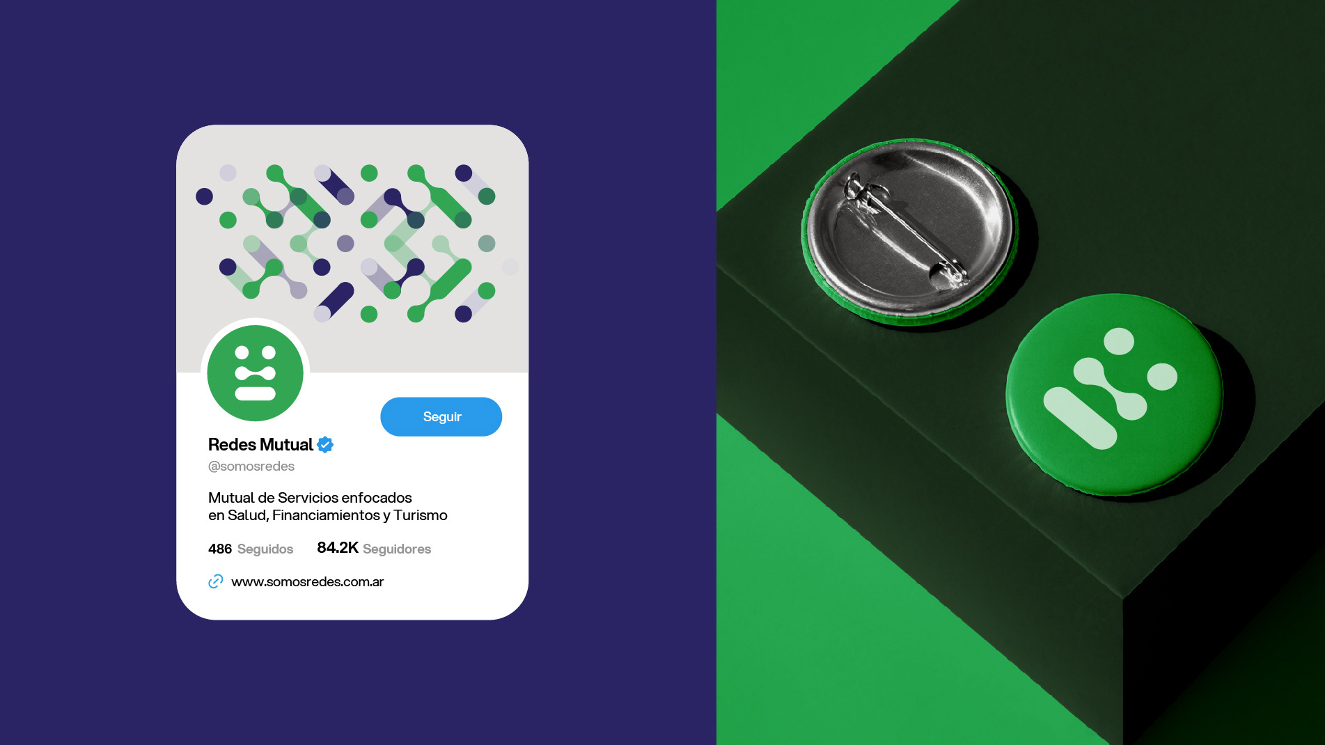
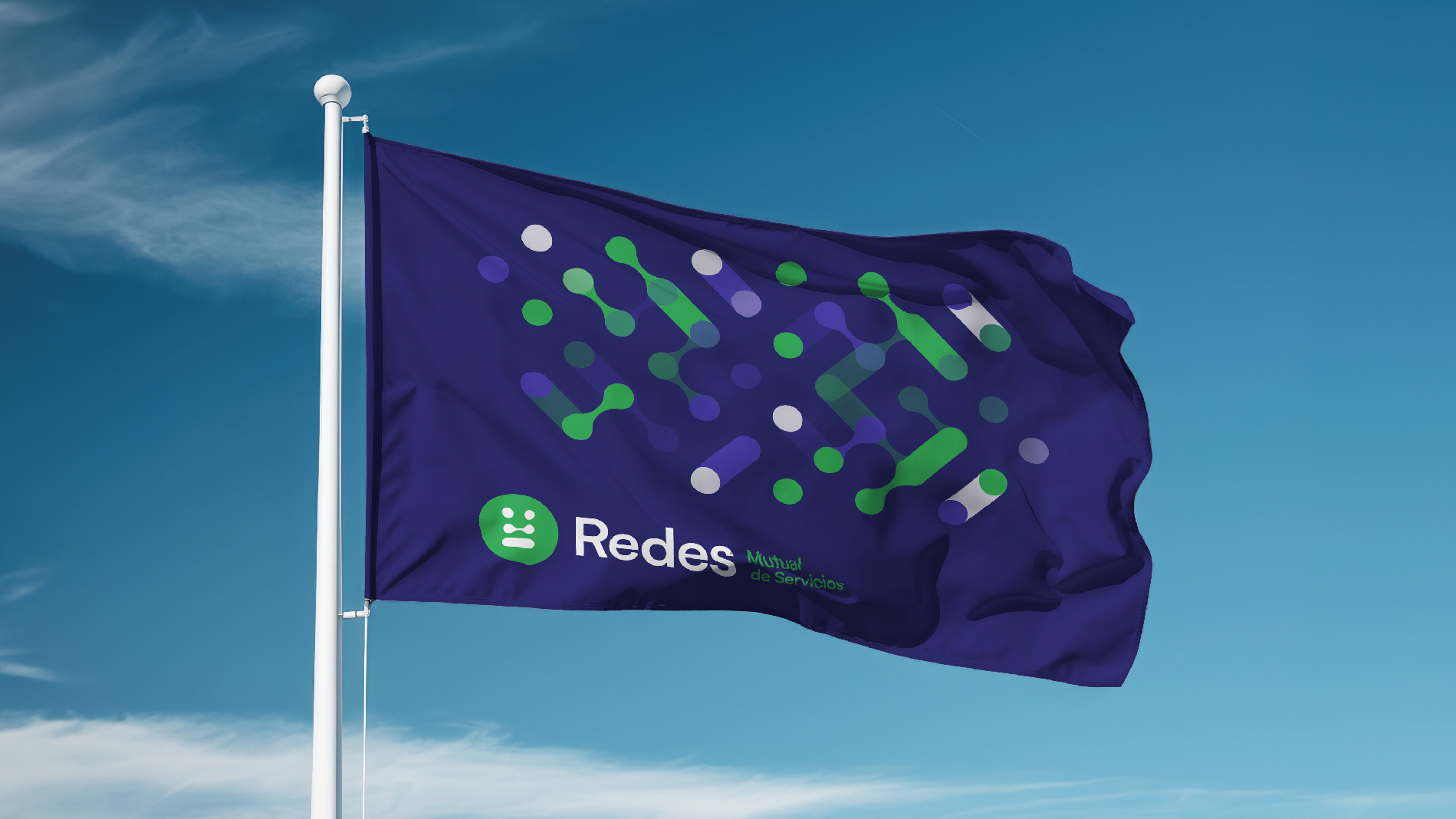
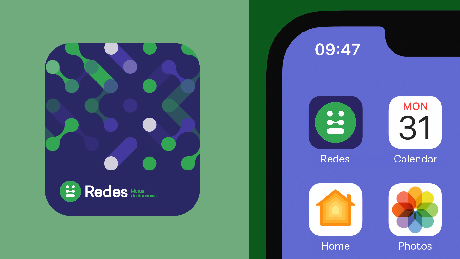
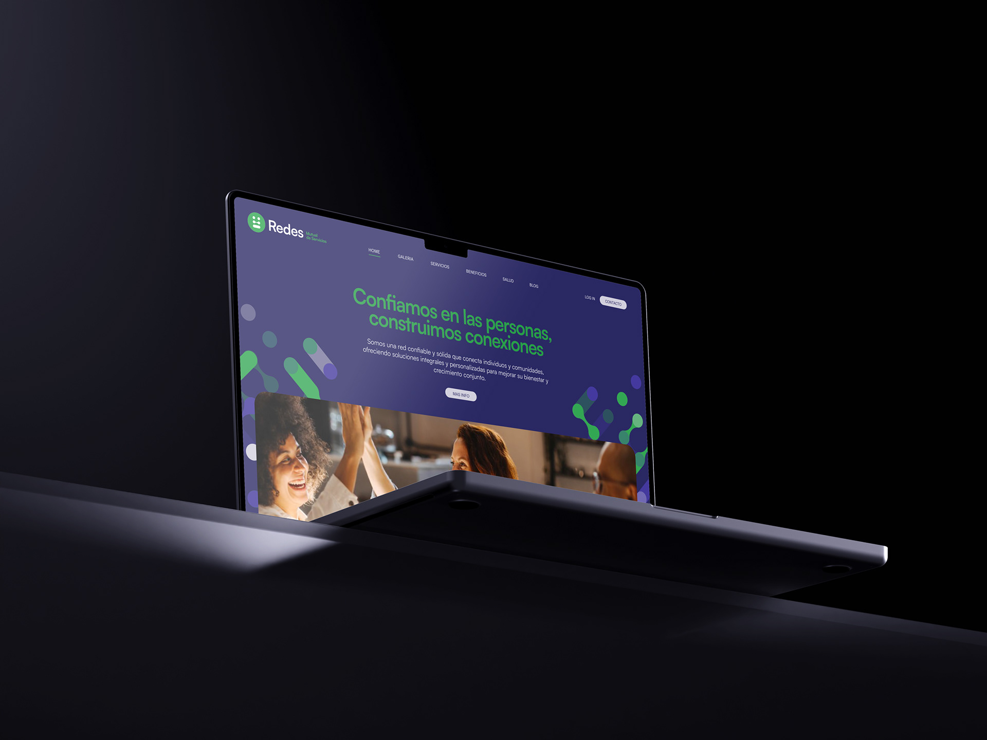
Sistema de Identidad Visual
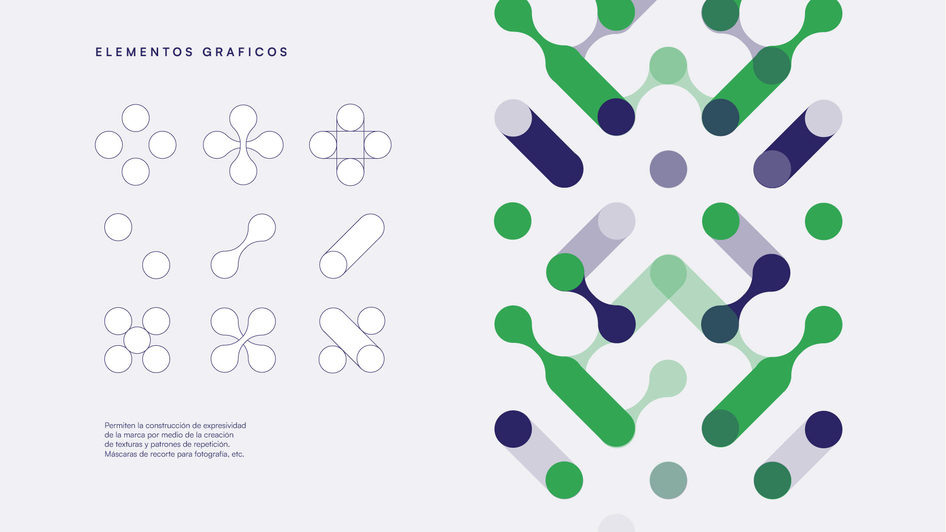
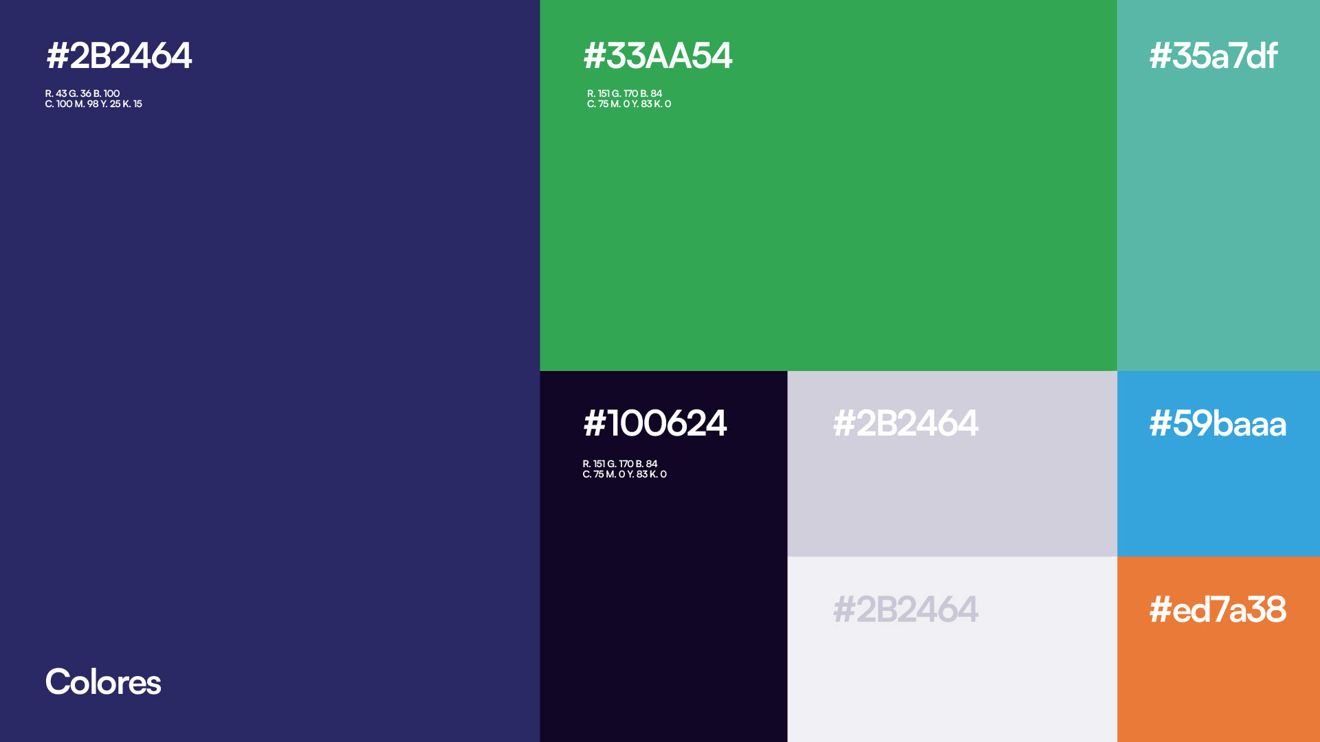
El sistema de identificación visual se centró en un símbolo que representa conexión y mutualidad, utilizando formas geométricas simples y colores vibrantes para transmitir energía y dinamismo.
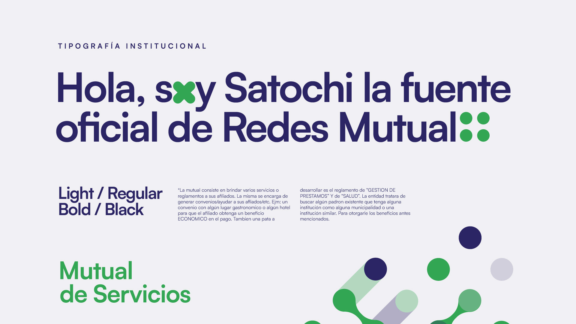
La tipografía utilizada fue la Satochi Variable, una fuente moderna y legible que complementa el símbolo, asegurando claridad y legibilidad. Este diseño cohesivo refuerza la presencia de marca en su contexto y facilita su reconocimiento en el mercado local.
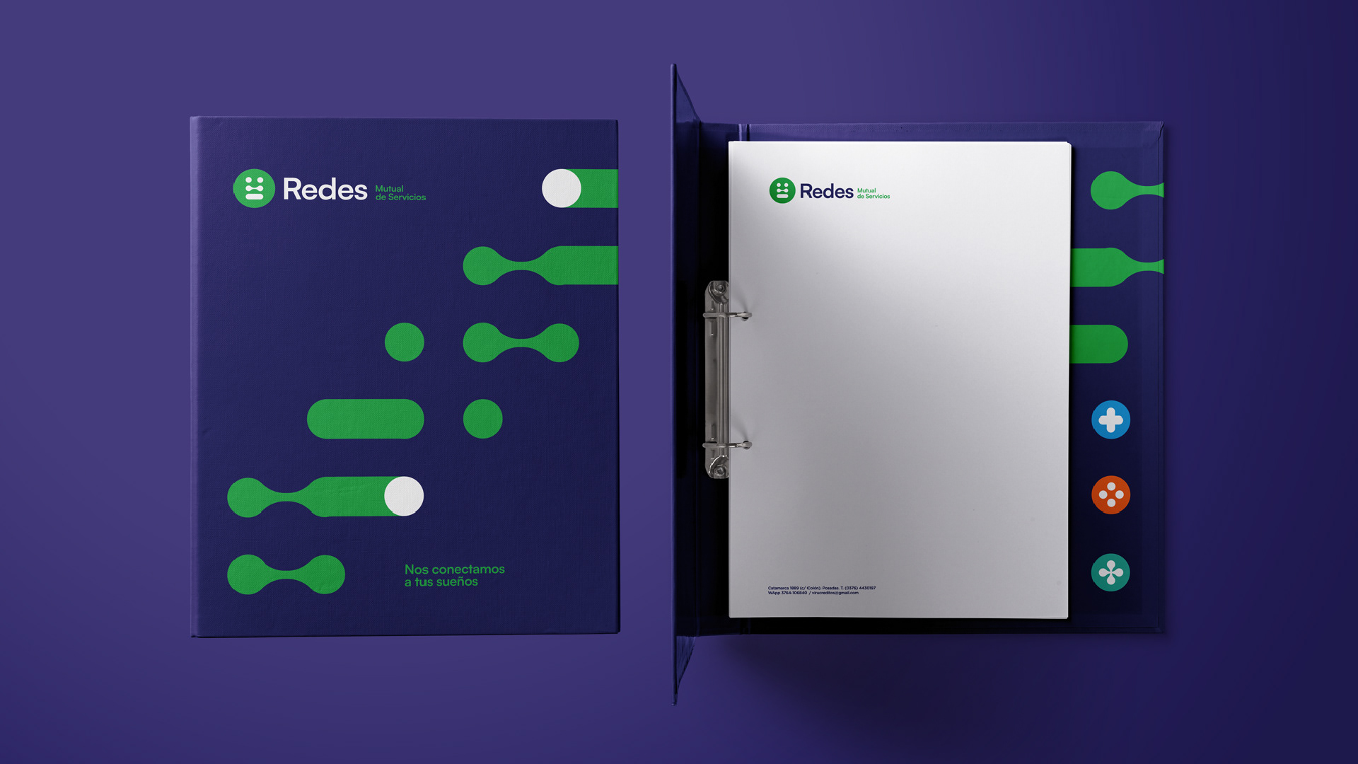
La implementación de esta identidad visual se realizó de manera coherente en todos los puntos de contacto, desde la papelería corporativa hasta las plataformas de social media, fortaleciendo su posicionamiento a travez de la construcción de confianza.
[EN]
The visual identity system centered around a symbol that represents connection and mutuality, utilizing simple geometric shapes and vibrant colors to convey energy and dynamism. The typography used was Satochi Variable, a modern and legible font that complements the symbol, ensuring clarity and readability. This cohesive design reinforces brand presence in its context and facilitates its recognition in the local market. The implementation of this visual identity was carried out consistently across all touchpoints, from corporate stationery to social media platforms, strengthening its positioning through the construction of trust.